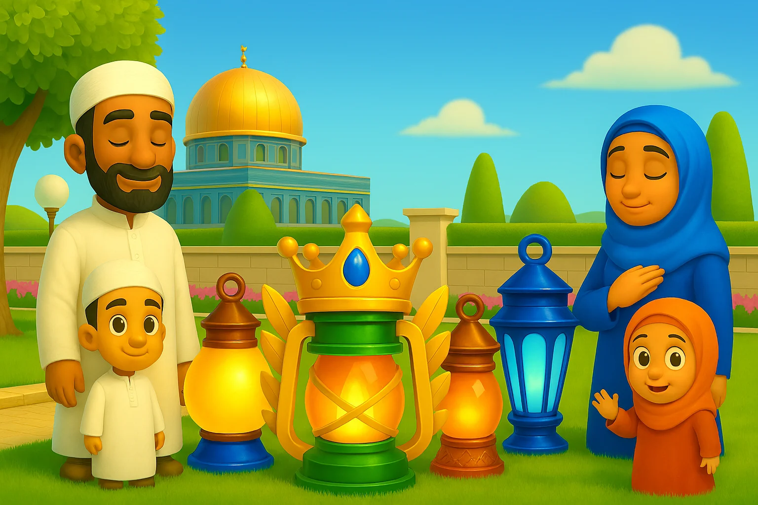
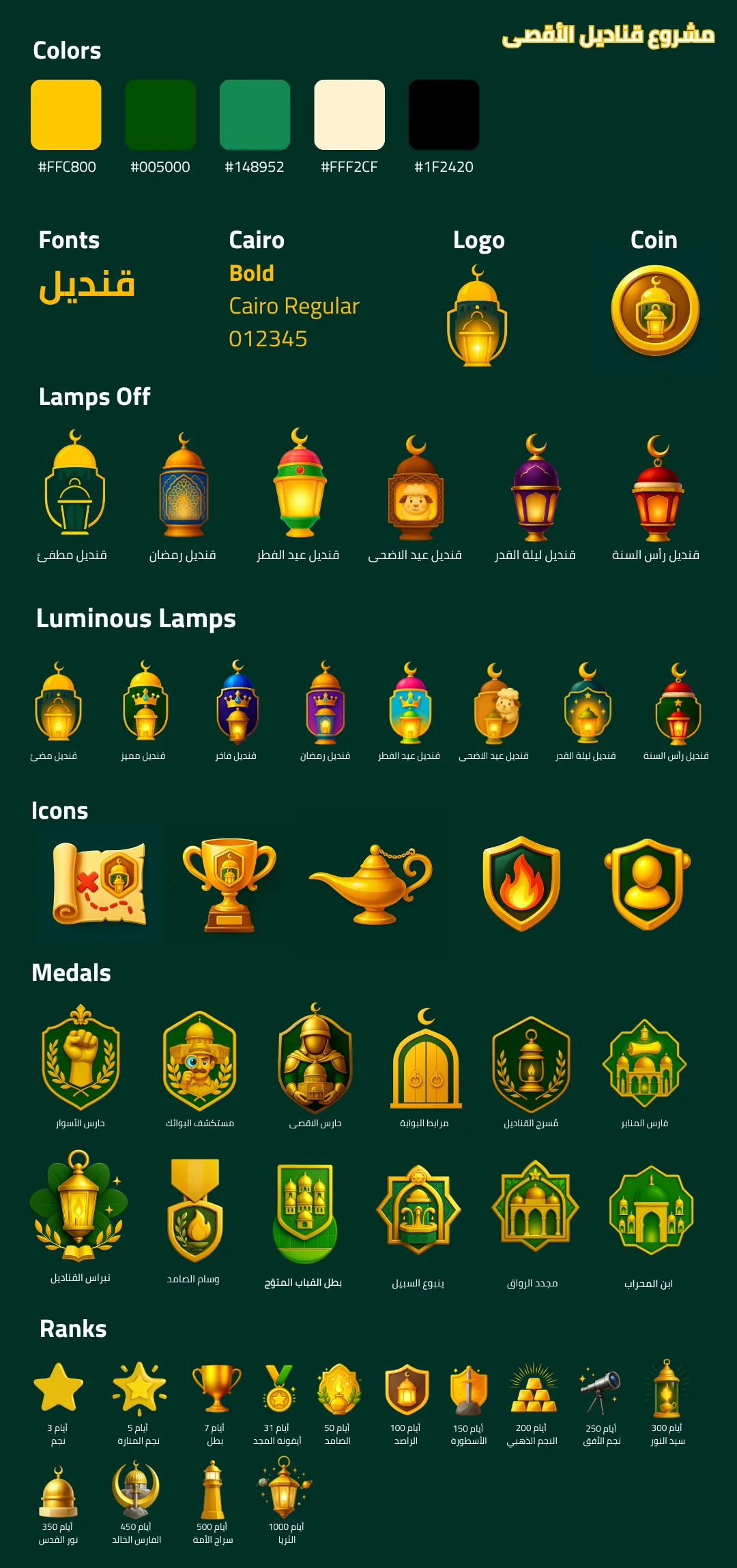
In Qandeel, artistic design evolves through thoughtful stages that
blend creativity, user experience, and visual identity.
We aim to craft a lively world of details—far more than a simple
interface.
We refined the core colors, typography, and visual language to reflect Qandeels warm spirit and playful world-building. The identity system now feels cohesive across screens, icons, and ingame scenes.
Early drafts explored interface shapes and interactive elements. This stage helped us align the art style with the narrative tone and the user journey.
We simplified navigation and flow to keep interactions smooth, ensuring a friendly and intuitive experience across all sections.
Subtle lighting, depth, and motion effects were added to bring the world to life while keeping the interface clean and readable.
We iterate based on feedback and testing, improving clarity and harmony while staying true to the visual identity.